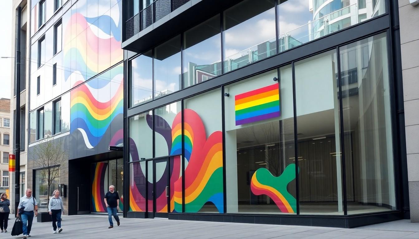
Developers are turning to CSS pride flags to add thoughtful, lightweight representation to websites, portfolios and community projects. This updated collection offers dozens of identity and movement flags, from Progress Pride and intersex-inclusive designs to agender, bisexual and aromantic options, all rendered with HTML and CSS rather than image files.
Essential Takeaways
- Wide flag selection: The collection covers community, identity, relationship and broader Pride designs.
- No image library required: Flags are created with CSS classes and a single stylesheet.
- Small icons included: Compact versions work well in menus, cards and profile interfaces.
- Accessibility matters: Add descriptive labels when a flag carries meaning rather than serving as decoration.
- Recent additions: Newer entries include Ally, Pride of Africa, Intersex-Inclusive and New Pride designs.
A colourful shortcut for inclusive web design
The appeal is immediate: a developer can add a recognisable flag without hunting for image files, resizing artwork or managing a separate icon pack. Once the stylesheet is loaded, a short class name creates the design in the browser, with crisp colours and no fuzzy edges.
That makes the collection useful for Pride landing pages, LGBTQ+ resource directories, event listings and personal profiles. It also keeps the visual language consistent, which is handy when a site needs several flags side by side. A broad reference guide from the Human Rights Campaign shows just how varied the wider flag landscape has become, so a sizeable collection is more practical than a one-size-fits-all rainbow.
From classic rainbow banners to newer symbols
The set moves well beyond the familiar six-stripe rainbow. It includes earlier rainbow designs, the Philadelphia flag, Progress Pride, an intersex-inclusive version, the Pink Triangle and social justice variations, alongside flags associated with specific communities.
That breadth reflects how Pride imagery has developed over time. Guides such as Japan Gay Guide's overview show that these designs can carry historical, cultural and personal meaning, rather than being interchangeable decorations. For a website owner, the lesson is simple: identify the flag accurately and don't assume every colourful design communicates the same thing.
The May 2025 update expanded the index with several additional designs and introduced styles for identities including demigender, demiboy, demigirl, omnisexual, neutrois, genderflux and unlabeled. It also added spectrum categories, giving users more choice without forcing every experience into a single visual shorthand.
How to add the flags with plain HTML and CSS
Setup is refreshingly uncomplicated. Load the minified stylesheet in the page head, then place a block with the flag class and the relevant identity class wherever the design should appear. The method is light enough for a small static site and straightforward enough for a larger component system.
For a full-size display, pair the flag with a visible heading or explanatory text. For instance, a Progress Pride block should be labelled as such rather than left for visitors to guess. The same approach works for the many identity flags in the collection, including transgender, non-binary, asexual, pansexual, genderfluid and genderqueer designs.
This is also where good accessibility practice earns its keep. If the flag communicates information, provide an accessible name or nearby text; if it's purely decorative, mark it accordingly. A colourful rectangle may look obvious to its creator, but not every visitor will recognise its meaning from colour alone.
Tiny icons make the collection more flexible
The project also provides icon-sized versions, which opens up more everyday uses. They can sit beside profile labels, event categories, navigation items or short community descriptions without taking over the page. Think of them as visual punctuation: small, useful and easy to scan.
The compact format is particularly effective in directories where space is tight. A row of large flags can feel heavy, while neat icons keep the interface calm. The updated icon layout improves that presentation, making the collection feel less like a code demo and more like a usable interface resource.
Still, don't rely on the icon alone. A tooltip, text label or accessible description makes the experience clearer, especially for visitors who use screen readers or aren't familiar with every flag.
Choosing the right flag for your project
Start with purpose, not colour. A community organisation might want the Progress Pride or intersex-inclusive design, while an individual profile may need a specific identity flag. If you're building an educational page, consider showing a small selection with explanations rather than presenting dozens of patterns without context.
It is worth checking terminology and current preferences before publishing. Community flags can evolve, and some designs have competing versions or different names. Reference material from LGBTQ+ organisations and dedicated flag guides can help you avoid presenting a personal or historical symbol as though it were universal.
There are technical choices, too. Test contrast against the page background, make sure icons don't collapse on narrow screens and avoid placing several striped designs together without labels. The colours may be bright, but the user experience should remain quiet and readable.
Why CSS is a sensible format here
CSS-based graphics are fast, scalable and easy to recolour or resize within a design system. They also avoid the maintenance burden of dozens of separate image assets. The accompanying open-source project is available under the MIT licence, which makes it approachable for personal experiments and many commercial builds, subject to checking the licence terms for your use.
That doesn't make the stylesheet a substitute for thoughtful content. Representation works best when it is accurate, purposeful and paired with clear language. Used well, these flags add warmth and recognition; used carelessly, they can become little more than decorative noise.
For developers, though, the practical win is undeniable. A single resource provides a large visual vocabulary, and your browser does the painting.
It's a small technical choice that can make an inclusive website feel far more considered.
Source Reference Map
Story idea inspired by: [1]
Sources by paragraph:
- Paragraph 1: [2], [4]
- Paragraph 2: [3], [7]
- Paragraph 3: [1], [5]
- Paragraph 4: [6], [4]
- Paragraph 5: [2], [7]
- Paragraph 6: [4], [7]
- Paragraph 7: [1], [5]
- Paragraph 8: [2], [4]
- Paragraph 9: [1], [6]
- Paragraph 10: [3], [7]
- Paragraph 11: [4], [7]
- Paragraph 12: [1], [5]
- Paragraph 13: [6], [4]
- Paragraph 14: [2], [3]