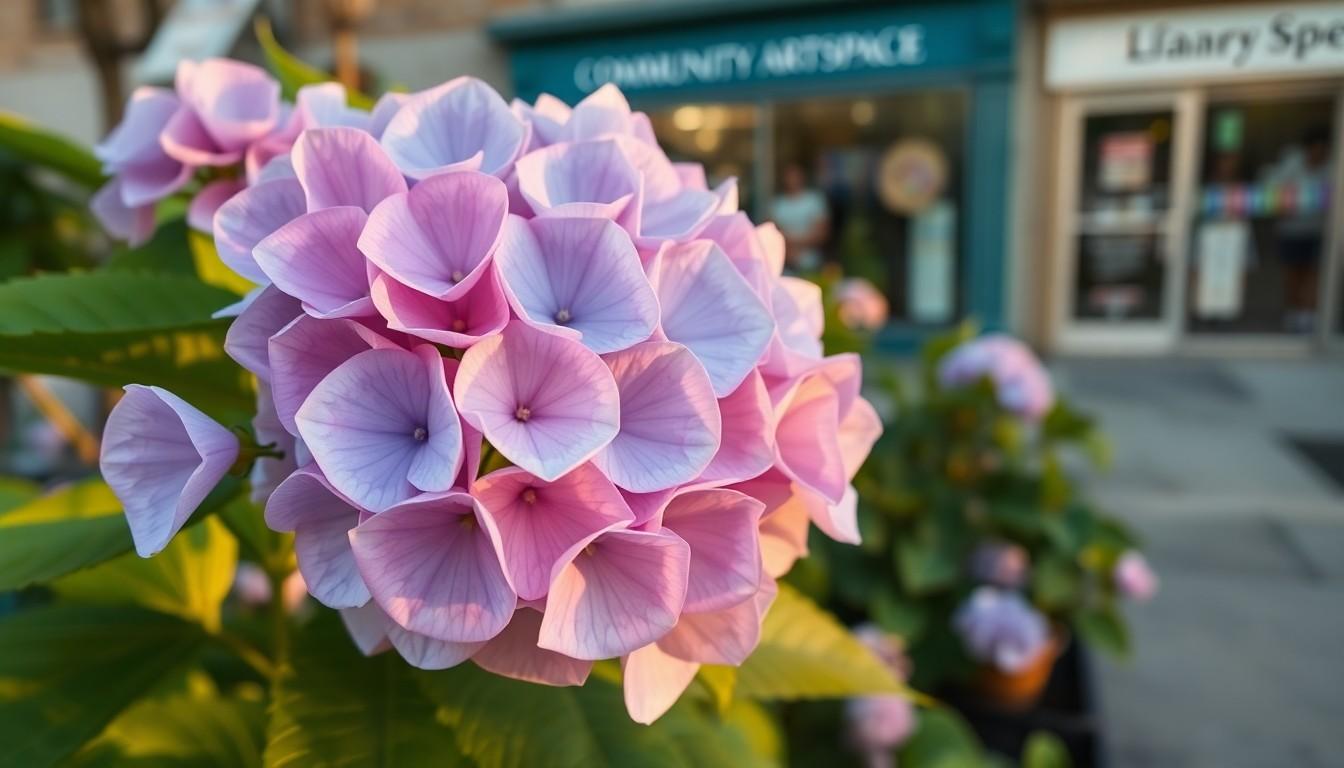
Artists and LGBTQ+ communities are using Bi Visibility Day to celebrate identity, challenge misunderstanding and make space for joy. One new hydrangea painting turns the bisexual flag’s pink, purple and blue into a soft, changing floral image, offering young queer people a reminder that identity can be both natural and beautiful.
Essential Takeaways
- A meaningful subject: The hydrangea reflects the bisexual flag while its changing colours suggest fluidity and personal growth.
- Visibility matters: Bi Visibility Day helps counter the erasure and stereotypes bisexual people can face within and beyond LGBTQIA+ spaces.
- Art offers another language: A painting can open conversations about identity, belonging and shared experience without needing a long explanation.
- Joy is central: The artist connects queer pride, autistic identity and creative expression through hopeful, celebratory work.
- Nature adds resonance: Hydrangeas are often associated with gratitude, emotion and transformation, making them a fitting symbol for the piece.
Why this hydrangea painting feels so fitting
At first glance, the artwork’s appeal is easy to understand. Hydrangeas are generous, rounded blooms, full of colour and texture, but their shades can shift according to the conditions around them. That makes the flower a thoughtful choice for a painting about bisexual identity.
The artist behind Changeling Craftworks says the blooms echo the pink, purple and blue of the bisexual flag. The connection isn't merely decorative. The plant’s changing appearance also reflects the way some Bi+ people understand their sexuality as fluid, personal and shaped by experience.
Hydrangeas have long carried symbolic associations with emotion and transformation, according to gardening reference guides. Here, that familiar garden flower becomes something more personal: a quiet statement of pride with a soft, welcoming feel.
What Bi Visibility Day represents
Bi Visibility Day is observed on 23 September and exists to make bisexual people and their experiences more visible. Organisations including the City of Boston and LGBTQ+ support groups describe the occasion as an opportunity to challenge misconceptions and recognise bisexual contributions to wider queer communities.
That visibility remains important because bisexual people can be overlooked from several directions. Some face pressure to prove their identity, while others encounter the assumption that bisexuality is temporary, indecisive or less valid than other sexual orientations. Those ideas can leave people feeling, as the artist puts it, not "queer enough".
A dedicated day can't solve those problems by itself, of course. But it can create a useful pause, especially for people who rarely see their experiences reflected in public conversation.
The bisexual flag’s colours carry a bigger message
The familiar bisexual flag uses pink, purple and blue, with each colour traditionally linked to a different part of attraction and identity. The purple centre is especially striking because it visually blends the pink and blue bands, creating a design that feels simple but layered.
Historical accounts of the flag's meaning vary in detail, but its colours have become widely recognised as a symbol of bisexual pride. That visual language makes the hydrangea painting immediately accessible, even to someone encountering the subject for the first time.
It also shows why flowers work so well in identity-focused art. A bloom can look delicate while carrying a message that is surprisingly firm. In this case, the colour palette does the explaining, while the living reference point keeps the image warm rather than overly formal.
Art can make room for queer and autistic joy
The artist says they were diagnosed as autistic at 29 and have since been exploring what it means to embrace both their queer and neurodivergent identities. Those experiences feed into their creative work, where joy isn't treated as a shallow extra but as a form of visibility in its own right.
That matters because public conversations about LGBTQ+ lives often focus on struggle, discrimination or coming out. Those stories are important, but they aren't the whole picture. There is also pleasure in making things, sharing them, finding community and seeing an identity represented without apology.
The artist points to a local Pride organisation's monthly art club as an example of creativity bringing people together. Everyone can work on their own project, yet still enjoy the calm, companionable energy of making things alongside others. It sounds simple, but those spaces can be quietly powerful.
Why representation can matter to younger LGBTQ+ people
For a young person still working out where they fit, a painting may offer recognition before they have the words to explain themselves. The hydrangea's message is particularly gentle: identity doesn't need to look rigid or stay perfectly still to be real.
Bisexual awareness resources stress the value of challenging erasure and creating more informed, supportive communities. Art contributes to that work by making abstract ideas visible. A flag can announce pride, while a flower can invite someone to stop, look and feel included.
The artist hopes young queer people take away a sense that their identity is natural and beautiful. That may sound modest, but in a culture still crowded with outdated assumptions, a joyful image can be a surprisingly strong act of reassurance.
A small painting with a wide emotional reach
The strongest part of this project is its lack of heaviness. It doesn't present bisexuality as something that needs defending through an argument. Instead, it offers colour, nature and pleasure, allowing the meaning to unfold at its own pace.
That approach feels especially suited to Bi Visibility Day. The date is about recognition, but visibility doesn't have to be loud to be effective. Sometimes it looks like a bright hydrangea on a screen, a shared art session or a young person realising that their identity belongs in the picture too.
Visibility can begin with a single image, but it grows through the conversations that image makes possible.
Explore creative work that makes LGBTQ+ identity visible, joyful and proudly individual.
Source Reference Map
Story idea inspired by: [1]
Sources by paragraph:
- Paragraph 1: [3], [4]
- Paragraph 2: [1], [4]
- Paragraph 3: [2], [5]
- Paragraph 4: [6], [7]
- Paragraph 5: [3], [5]
- Paragraph 6: [2], [6]
- Paragraph 7: [1], [3]
- Paragraph 8: [1], [6]
- Paragraph 9: [1], [4]
- Paragraph 10: [5], [7]
- Paragraph 11: [1], [6]
- Paragraph 12: [2], [5]
- Paragraph 13: [1], [4]
- Paragraph 14: [1], [6]
- Paragraph 15: [3], [5]
- Paragraph 16: [1], [2]