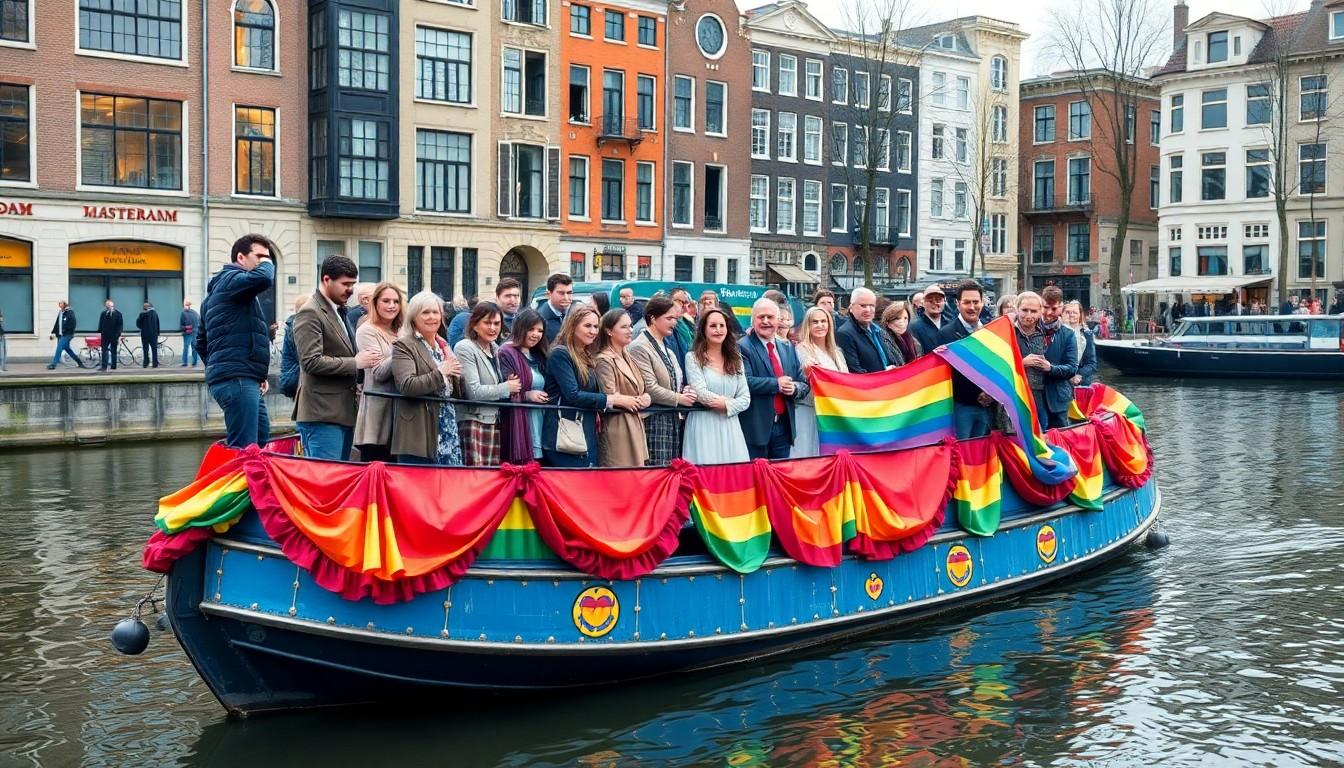
Catch the colour, creativity and messages that made the Canal Parade boats stand out at WorldPride Amsterdam 2026 , from cheeky cultural riffs to bold campaigns that turned floats into moving manifestos, and why those close-up moments on the Prinsengracht felt surprisingly intimate and electric.
Essential Takeaways
- Visual variety: Community groups, artists and corporates all brought distinct, highly detailed boats that rewarded a close-up view.
- Top winners: The Kissing Couple won Best Visualization of Unity; De Boekenboot took Best Statement/Campaign.
- Tactile moments: Watching from the tribune allowed photographers to capture faces, fabrics and gestures usually missed from the canal edge.
- Meaningful themes: Entries linked queer visibility to literature, unity and freedom of expression , messages that landed as well as the costumes.
- Corporate presence: Brands like KPN won categories, showing big players can still contribute creative, advocacy-focused entries.
A parade of stories: why each boat felt like a scene in a play
The Canal Parade has always been more than a procession; this year it felt like a string of tiny theatrical productions, each with its own set, costume and soundtrack. From a few metres away on the Prinsengracht tribune you could read banners, watch performers interact with the crowd and feel the immediate delight when a visual gag landed. Pride Amsterdam’s official programme shows the parade intentionally mixes community groups, cultural projects and corporate entries, and that variety is what keeps the route lively.
The up-close vantage point changed the experience. Photographers and spectators reported that the texture of fabrics, the intensity of facial expressions and the careful signage suddenly mattered in a different way. If you go next time, try the tribune or book a spot on a canal-side platform , you’ll see details that turn slogans into stories.
The Kissing Couple: humour, provocation and winning unity
One of the most talked-about entries was The Kissing Couple, which won Best Visualization of Unity. It took a familiar Dutch motif and gave it a WorldPride twist that was playful, provocative and instantly recognisable, so people nearby reacted out loud and often. The boat’s strength was how it combined cultural reference with a simple human gesture , a good reminder that strong visuals needn't be complicated.
This kind of concept works especially well in Amsterdam, a city that appreciates irony and directness. For designers choosing a theme, think culturally resonant images and a twist that invites conversation rather than confusion.
De Boekenboot: literature, visibility and a tangible message
De Boekenboot earned Best Statement/Campaign for good reason; its giant open-book design and the theme “Free the word – Every Story Counts” made the connection between queer visibility and freedom of expression immediate and physical. Being only a metre or two away meant the shipboard energy felt tangible , the readers, performers and illustrators on board turned a campaign slogan into a lived moment.
The boat’s visuals, credited to illustrator Flo de Goede, show how collaboration with committed artists can lift a message. If you’re planning a creative entry or event, commissioning a strong visual voice can make a campaign feel less like advertising and more like a communal act.
Design winners and corporate creativity: when branding joins the party
Other prizes highlighted different strengths: We are Family won Best Design/Execution for its craftsmanship and coherent aesthetic, while KPN picked up Best Corporate Statement, illustrating that corporate entries can be imaginative and message-driven rather than purely promotional. The judges clearly rewarded boats that balanced looks with intent.
For brands weighing participation, the Canal Parade demonstrates there’s room to be both visible and respectful. Work with community partners, pick a clear stance, and focus on creative execution , the crowd notices authenticity.
Why the tribune changed the photography game
Photographers loved the tribune because it turned the flotilla into a sequence of portrait opportunities. Faces, fabrics, and fleeting gestures that might be lost at a distance were suddenly foregrounded, producing images that felt intimate and immediate. The crowd’s reactions amplified this: cheers, whistles and laughter became part of the composition.
If you’re shooting or just watching, consider arriving early to secure a vantage point. A close view doesn’t just improve pictures; it changes how you feel about the parade , more participant than spectator.
It's a small change that can make every float feel close to home.
Source Reference Map
Story idea inspired by: [1]
Sources by paragraph: