Celebrate with purpose: readers are revisiting the Progress Pride Flag to understand who each stripe represents and why the redesign matters for inclusion, visibility and healing within LGBTQ+ communities. This quick guide unpicks the colours, their history and how to choose or display a flag that speaks to your values.
Essential Takeaways
- Design origin: The Progress Pride Flag was designed by Daniel Quasar in 2018 to broaden the original rainbow’s message of unity.
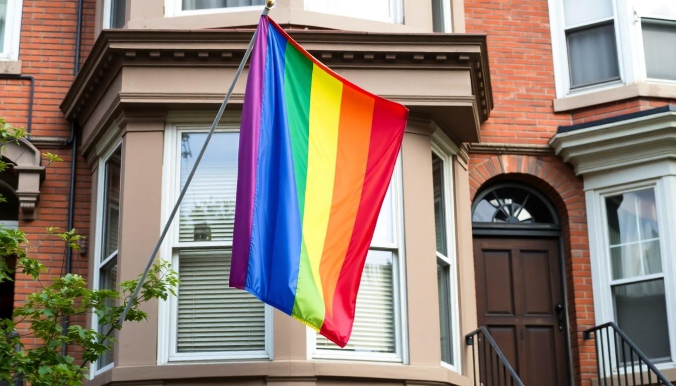
- Core rainbow meaning: Red, orange, yellow, green, blue and violet retain their classic symbolism , life, healing, sunlight, nature, serenity and spirit.
- Added stripes for inclusion: The chevron adds white, pink and light blue to honour trans people, plus brown and black to represent racialised queer communities and those lost to HIV/AIDS.
- Visual cue: The arrow-shaped chevron points forward to signal progress, not perfection , it’s about direction and solidarity.
- Practical note: Flags come in many prints; choose durable materials and the right size for indoor or outdoor use to keep colours vivid.
Why the Progress Pride Flag matters now
The Progress Pride Flag adds a hush of urgency to the familiar rainbow , you notice the chevron immediately, a visual nudge towards inclusion. Daniel Quasar created it to blend three historical references: Gilbert Baker’s original rainbow flag, Monica Helms’ trans flag, and Philadelphia’s addition of black and brown stripes. According to museum and design coverage, it’s meant to correct omissions and make the banner more explicitly welcoming.
This isn’t just wardrobe change; it’s a statement. For many, the extra stripes feel like recognition of intersecting identities and histories that were marginalised in mainstream Pride imagery. And because it’s readable at a glance, it’s become a popular choice for Pride events, schools, workplaces and activists looking to be deliberate about who they lift up.
What each rainbow colour still stands for
The six-colour rainbow keeps its original, emotionally resonant meanings: red for life, orange for healing, yellow for sunlight or visibility, green for nature and growth, blue for serenity and violet for spirit. Museums and vexillology sites note that these hues were chosen early on for their simple, almost tactile symbolism , they’re easy to remember and feel personal.
If you’re buying a flag, you’ll often see these colours rendered in slightly different shades. That’s okay , the symbolism holds even when tones shift. For Pride displays, brighter yellows and richer violets catch the eye; for more subtle settings, muted versions still carry the message.
The chevron: trans visibility and racial inclusion
The left-pointing chevron adds white, pink and light blue , borrowed from Monica Helms’ trans flag , to represent trans masculine, trans feminine and non-binary or transitioning people. Brown and black stripes were later added in Philadelphia-inspired versions to foreground queer people of colour and those affected by HIV/AIDS.
Those additions aren’t decorative. They were introduced because many activists felt the original rainbow didn’t speak to the layered realities of racism, transphobia and the AIDS crisis. Industry write-ups and LGBTQ historians say the chevron’s arrow shape intentionally points forward, signalling progress and a commitment to do better.
Picking and caring for your flag
Think about where you’ll use the flag: an indoor office, a front garden or a march. Outdoor flags need heavier fabric and reinforced stitching; indoor ones can be lighter and printed on cotton blends. If representation is the point, check the design: some flags show the chevron with or without the black stripe, while others use alternative colour orders , know what message you want to send.
Wash or hand-clean gently; sun fades dyes over time so consider a UV-resistant fabric if you’ll leave it outside. And store your flag flat or rolled, not folded, to prevent creases that obscure the chevron’s shape.
How communities have reacted , and what comes next
Reactions have been largely positive, especially among activists and institutions looking to modernise Pride symbolism. Coverage from cultural institutions and LGBTQ press highlights that the Progress Pride Flag offers a clearer, more intersectional visual language. But design changes also spark debate: some people prefer the original rainbow’s simplicity and universal recognisability.
Looking ahead, expect more variations as groups adapt the flag to local needs , the point is less about a single, perfect banner and more about keeping conversation and inclusion moving forward.
It’s a small visual change with a big heart , choose the flag that best reflects the people you want visible.
Source Reference Map
Story idea inspired by: [1]
Sources by paragraph: