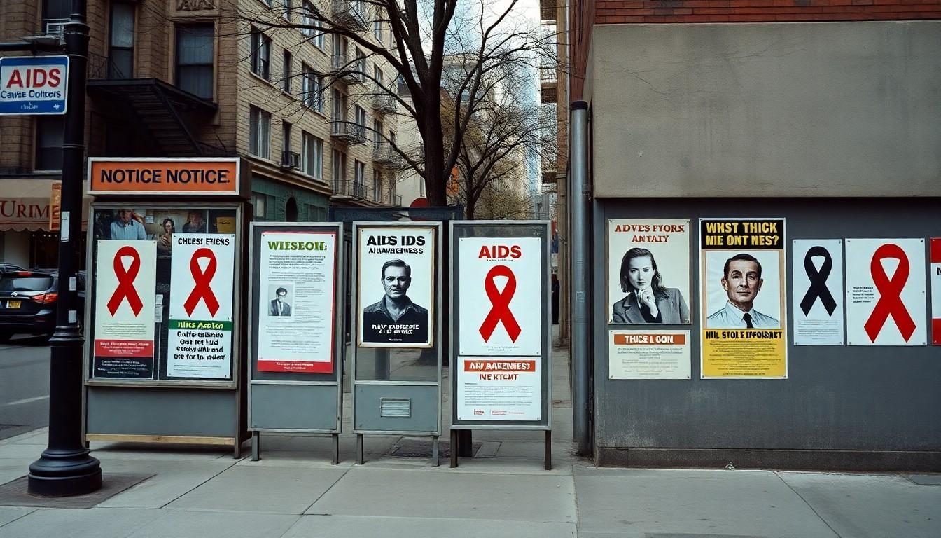
A single pink triangle and three urgent words turned a New York street poster into a rallying cry during the AIDS crisis. Created by the Silence=Death Project, the design challenged public silence, stigma and political inaction, showing how a spare visual message could make an emergency impossible to ignore.
Essential Takeaways
- A stark visual: The poster paired a pink upright triangle with the words “SILENCE = DEATH”.
- A collective effort: The Silence=Death Project was formed by gay men, many of them graphic designers.
- A reclaimed symbol: The triangle reworked a symbol imposed on gay men under Nazi rule.
- A public intervention: Posters spread across New York City to raise awareness and encourage community organising.
- A lasting legacy: The design remains part of the history of AIDS activism and political poster art.
A pink triangle made a quiet street speak
The design is almost startlingly simple: a pink triangle, upright and alone, above the words “SILENCE = DEATH”. That restraint was part of its force. Against the visual clutter of a city street, the message could register quickly, then linger.
The Silence=Death Project created the poster in response to the AIDS epidemic and the lack of public attention and resources devoted to it. The group, made up of gay men including graphic designers, used a direct, high-contrast design to demand that the crisis be seen. The National Library of Medicine’s AIDS poster collection documents how graphic design became one tool for communicating about the epidemic. (Sources: David Zwirner; National Library of Medicine)
Why the triangle carried such weight
The pink triangle had a brutal history. Under the Nazi regime, gay men were marked with an inverted pink triangle in concentration camps. The US Holocaust Memorial Museum explains how Nazi authorities persecuted gay men, making the symbol’s history inseparable from state violence and stigma. (Sources: US Holocaust Memorial Museum; Poster House)
The poster turned that imposed mark upright, reclaiming it as a sign of visibility and resistance. That choice made the design more than a warning: it connected the urgency of the AIDS crisis with a longer history of people being silenced and targeted. The Henry Ford’s account of the early AIDS response places the poster within a wider movement of activism and public education. (Sources: US Holocaust Memorial Museum; The Henry Ford)
New York’s walls became part of the message
Posters were put up across New York City, taking the message beyond galleries and community meeting rooms. The city’s streets offered a large, everyday audience, including people who might otherwise have looked away from the epidemic. That public placement helped turn a graphic into a direct challenge to shared responsibility. (Sources: NYC LGBT Historic Sites Project; The Henry Ford)
The campaign also made a pointed argument about silence. If officials and the wider public treated AIDS as someone else’s concern, the crisis could remain invisible to those with the power to respond. A poster could not replace medical care or policy, but it could make avoidance harder.
The power of a message you can read in seconds
The poster’s visual economy still feels striking. There’s no crowded layout or complicated explanation to decode; the triangle and words do the work from a distance. Poster House includes the design in its collection, while David Zwirner has presented it as part of the history of AIDS-related art and activism. (Sources: Poster House; David Zwirner)
That simplicity wasn’t a lack of ambition. It was a practical choice for a public campaign: a clear symbol could travel, repeat and be recognised. The National Library of Medicine’s collection shows how posters helped activists and health organisations communicate urgent information during the epidemic. (Sources: National Library of Medicine; The Henry Ford)
A reminder that visibility can be a form of care
The Silence=Death poster remains a sharp example of design doing more than decorating a wall. It used a familiar symbol in a new way, then placed the result where people couldn’t easily avoid it. Its message was blunt because the stakes were high.
And there’s a human truth beneath the graphic punch: being seen can be dangerous, but being forced into silence can be dangerous too. The poster’s lasting power comes from holding both ideas together, and insisting that public attention matters. (Sources: The Henry Ford; David Zwirner)
A small design can’t solve a crisis, but it can help make looking away much harder.
Source Reference Map
Story idea inspired by: [1]
Sources by paragraph: