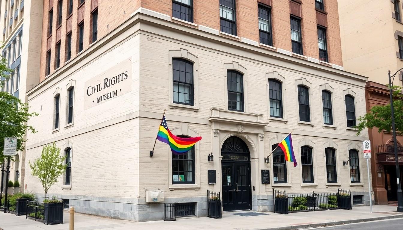
Flags are flying high over the Stonewall Inn and far beyond, carrying stories of protest, survival and belonging. From the lambda and pink triangle to Gilbert Baker's rainbow and the Progress Pride Flag, these designs show how LGBTQ+ communities have reclaimed painful histories while making space for a more inclusive future.
Essential Takeaways
- The lambda: Adopted by New York's Gay Activists Alliance in 1969, it represented catalytic change and collective energy.
- The pink triangle: Once a Nazi concentration-camp marking, it was reclaimed by LGBTQ+ activists as a symbol of resistance.
- The rainbow flag: Gilbert Baker's original eight-colour design appeared publicly in San Francisco in 1978 before becoming the familiar six-stripe banner.
- The Progress Pride Flag: Daniel Quasar's 2018 design adds transgender, non-binary, Black, brown and HIV-related representation.
- The wider message: These symbols aren't decoration alone. They signal memory, solidarity and a safer welcome.
The lambda turned protest into a visual shorthand
Some symbols arrive quietly, then gather momentum. The Greek letter lambda became one of the earliest visual emblems of the modern gay rights movement after the Gay Activists Alliance adopted it in New York in December 1969, just months after the Stonewall uprising.
According to the US National Park Service, the GAA formed in the charged atmosphere that followed Stonewall and used direct action to demand civil rights. The lambda's meaning was especially neat: in chemistry, it could suggest a catalyst, while activists also connected it with energy, unity and transformation.
That flexibility helped the symbol travel. The lambda was later adopted internationally, although some people mistakenly read it as representing men alone. Even so, its core idea remains strikingly modern: people joining forces can create change that none could achieve separately.
The pink triangle carries a darker history
The pink triangle has perhaps the heaviest emotional weight of the major LGBTQ+ symbols. During the Nazi era, it was used to mark men imprisoned for homosexuality in concentration camps, turning a simple shape into an instrument of humiliation and persecution.
History.com records how activists reclaimed the triangle in the 1970s, often placing it on a black background as a deliberate act of defiance. The gesture transformed a badge of oppression into a public statement of identity and resistance.
That history also exposes how long official recognition took. Men imprisoned under Nazi-era anti-homosexuality laws could remain incarcerated after the Second World War, and Germany did not issue formal pardons until 2002. A symbol that appears bold on a banner can therefore carry grief, anger and remembrance in equal measure.
Why the rainbow flag still feels instantly welcoming
The rainbow flag made its public debut in San Francisco in June 1978, during celebrations linked to gay pride. Artist and activist Gilbert Baker created the original eight-stripe version with help from volunteers, imagining a colourful emblem for a broad and diverse community.
The design was later reduced to six stripes, partly because some fabric colours were difficult to source and the flag needed to be practical to produce. Its appeal was immediate: the colours were bright, readable from a distance and emotionally warmer than a conventional protest banner.
That combination explains its staying power. Whether it hangs above a community centre, appears in a shop window or flutters outside a private home, the rainbow flag can work as both celebration and reassurance. It's a remarkably efficient way of saying, "You belong here."
The Progress Pride Flag makes inclusion more visible
The Progress Pride Flag builds on the rainbow rather than replacing it. Designed by Daniel Quasar in 2018, it places black, brown, light blue, pink and white stripes in an arrow-shaped chevron along the hoist side of the familiar flag.
The design foregrounds people of colour, transgender and non-binary communities, while the black stripe also acknowledges people living with HIV, those affected by stigma and those who have died. According to the design's creator, the arrow points forwards, making progress feel like an ongoing responsibility rather than a finished achievement.
That message helps explain why the design spread so quickly online and in public spaces. It gives organisations a way to show that "LGBTQ+" isn't a single experience, while reminding viewers that visibility needs to keep expanding. In other words, the chevron isn't just an extra splash of colour; it's a nudge not to stop halfway.
Choosing a flag depends on the message you want to send
For anyone displaying a flag, context matters. A classic rainbow design offers an instantly recognisable welcome, while a Progress Pride version communicates a more specific commitment to intersectional inclusion. The lambda and pink triangle, meanwhile, connect today's visibility with the movement's earlier struggles.
Quality matters too, particularly outdoors. Look for strong stitching, colourfast fabric, reinforced eyelets and a size suited to the pole or window where the flag will be displayed. A soft, faded banner may look charming indoors, but a flag exposed to wind and rain needs sturdier construction.
Most importantly, these designs work because people understand their stories. A flag can brighten a street, but its real force comes from the history behind it and the people who continue to carry that history forward.
Let the colours fly, but remember the lives and struggles woven into them.
Source Reference Map
Story idea inspired by: [1]
Sources by paragraph:
- Paragraph 1: [2], [3]
- Paragraph 2: [3], [4]
- Paragraph 3: [4], [5]
- Paragraph 4: [2]
- Paragraph 5: [2], [6]
- Paragraph 6: [3], [7]
- Paragraph 7: [4], [5]
- Paragraph 8: [3], [6]
- Paragraph 9: [4], [7]
- Paragraph 10: [2], [3]
- Paragraph 11: [4], [5]
- Paragraph 12: [3], [6]
- Paragraph 13: [4], [7]
- Paragraph 14: [2], [3]
- Paragraph 15: [4], [5]