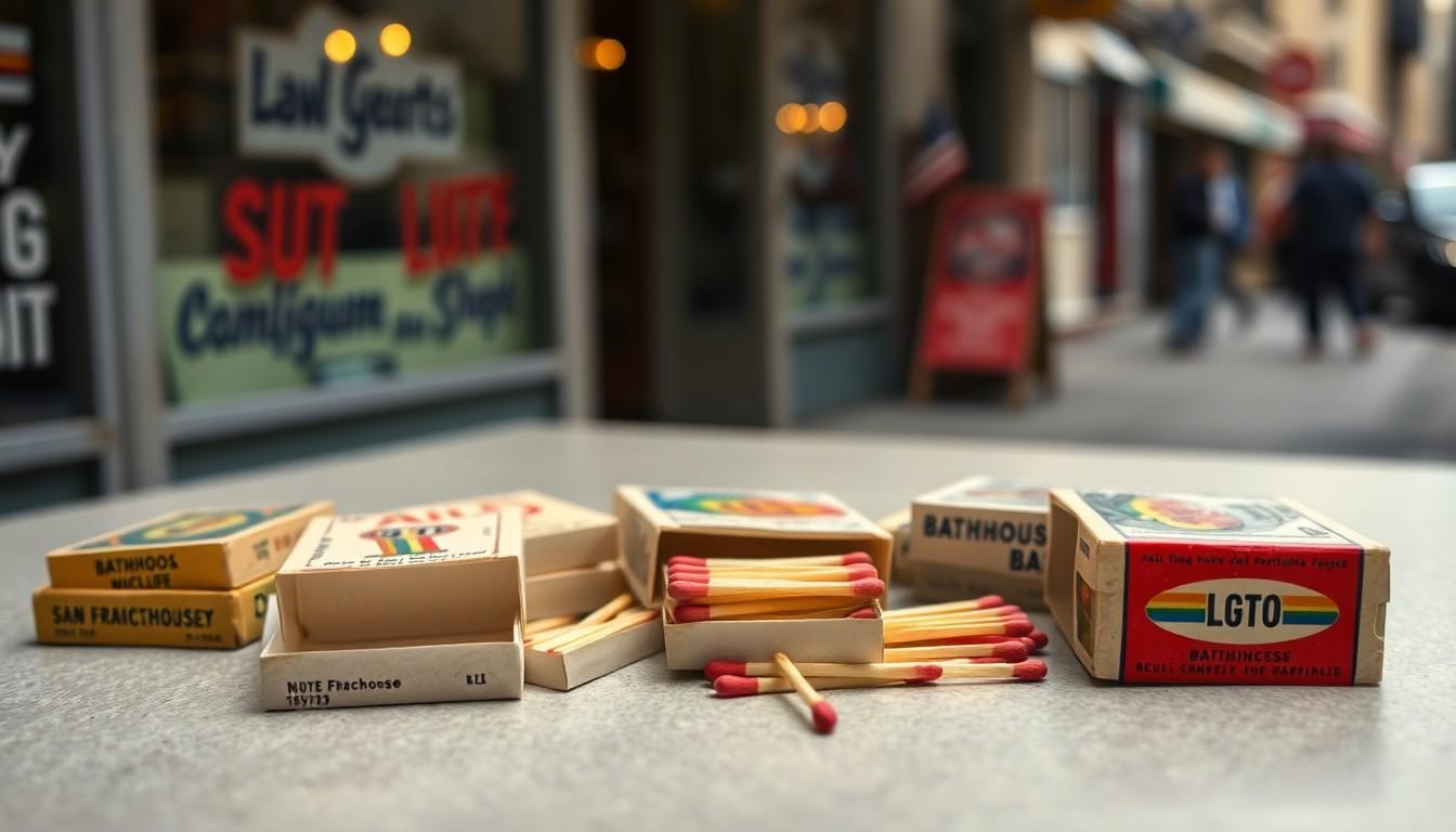
Collectors are looking back at gay matchbooks from 1970s America, when a small packet of matches could point towards a bar, a bathhouse or a promising night out. Long before dating apps, these colourful objects blended coded communication, graphic design and queer community, offering clues to spaces that often stayed deliberately discreet.
Essential Takeaways
- Tiny but informative: Matchbooks could advertise venues while helping visitors remember names, addresses and phone numbers.
- Discretion mattered: Many queer venues kept a low profile, so printed objects carried information that signs could not.
- Design did the talking: Typography, illustrations and suggestive symbols created a visual identity for each venue.
- The hanky code had company: Coloured handkerchiefs communicated sexual interests, but matchbooks offered a broader invitation to gather.
- A fragile archive survives: Preserved matchbooks now reveal how queer people found one another before digital platforms.
Before dating apps, a matchbook could be a useful clue
Today, finding a queer bar usually takes a few taps. In the 1970s, the route could begin with a matchbook slipped across a counter, carried in a pocket or passed between friends. It was practical, discreet and just intriguing enough to make an ordinary request for a light feel like a conversation starter.
The objects featured venue names, addresses and distinctive artwork, giving people a way to identify welcoming places without relying on prominent exterior signs. According to queer history resources, discretion was often essential, particularly when venues faced stigma, surveillance or unwanted attention. [2]
That made the matchbook more than a bit of branded packaging. It was a portable signpost, a keepsake and sometimes a quiet nudge towards a night that might otherwise have been difficult to find.
The artwork was part of the invitation
The appeal wasn't only informational. These matchbooks gave bars and bathhouses their own visual language, using playful lettering, bold illustrations and winkingly suggestive imagery to create a sense of possibility.
Some designs were direct, while others relied on humour and visual clues. A boot, a hole, a pair of lips or a muscular figure could say plenty without spelling everything out. The result was a pocket-sized form of advertising that felt more personal than a conventional poster.
That visual shorthand sits alongside the better-known hanky code, in which coloured handkerchiefs could signal sexual preferences or intentions. Historical accounts describe the code as a flexible system rather than a universal rulebook, with meanings varying between communities and places. [3]
Matchbooks and hankies spoke different languages
The hanky code was often about what someone was looking for. Matchbooks were more likely to answer a different question: where could people go? That distinction matters, because queer social life depended on both private signals and shared public spaces.
A coloured hanky might invite a specific kind of conversation, while a matchbook could point towards a venue where friendships, flirtation, dancing and sex were all possible. The two systems overlapped, but neither told the whole story.
Guides to hanky-code history also stress that colours and meanings weren't always fixed. They changed over time and could differ between scenes, so reading the code required local knowledge, confidence and a willingness to ask. [4]
Why the design still feels surprisingly modern
There’s something familiar about the way these objects built a brand. Each venue needed a recognisable personality, and the matchbook delivered it in a format that was cheap to produce but easy to remember. Long before Instagrammable interiors and carefully managed online identities, a bar could make an impression through a few inches of card and ink.
The most successful designs seem to understand that people weren't simply buying a drink. They were buying access to a mood, a community and the possibility of meeting someone interesting. In that sense, the matchbook was both advertisement and tiny fantasy object.
It also offered a useful kind of privacy. A person could carry information about a venue without displaying it openly, a small but meaningful advantage in an era when queer life often had to be negotiated carefully. [5]
What collectors can learn from these pocket archives
Taken together, the matchbooks show how queer people navigated cities through memory, recommendation and visual recognition. They preserve the names of venues, but they also capture the tone of a scene: cheeky, theatrical, coded and occasionally gloriously unsubtle.
For modern collectors, condition is only part of the story. A faded object with a handwritten number or a well-worn cover may reveal more about everyday use than a pristine example. The marks of handling are evidence that these weren't merely decorative pieces; they moved through real communities.
The hanky code's history offers a useful reminder here. Symbols only work when people share enough context to understand them, and that context is always shaped by place and time. [6] What looks obvious in an archive may have been more ambiguous in a crowded bar.
A small archive with a big emotional charge
Matchbooks can seem quaint beside location apps and instant messaging, but their importance lies in the effort they represent. Finding one another took patience, nerve and a sharp eye for clues. Even a simple packet of matches could carry the promise of belonging.
That’s why these objects still resonate. They don't just document where people went; they suggest how queer people made spaces for themselves when mainstream culture offered little help. A pocket-sized design could become a map, a memory and an invitation all at once.
The wider lesson is quietly moving: technology changes the route, but the desire to find community remains stubbornly familiar. [7]
A matchbook was never just for lighting a cigarette; it could light the way to a whole queer world.
Source Reference Map
Story idea inspired by: [1]
Sources by paragraph: