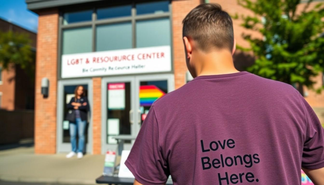
Supporters are embracing a new Bi Visibility Day design that turns the bisexual flag into a hopeful floral emblem. Created by Boston illustrator Liz Zonarich for the Bisexual Resource Center, the “Bi+ Love Belongs Here” artwork will feature on a fundraising T-shirt, giving shoppers a wearable way to support community-building and visibility.
Essential Takeaways
- Winning design: Liz Zonarich created “Bi+ Love Belongs Here” for the Bisexual Resource Center’s competition.
- Floral symbolism: Three flowers represent the colours of the bisexual flag, growing from one strong stem.
- Fundraising purpose: The design will appear on a T-shirt sold through the organisation’s website.
- Message behind it: The artwork links visibility with care, welcome and active community participation.
- Why it matters: Bi Visibility Day helps challenge erasure while creating space for bisexual people and allies.
A floral design with a bigger message
At first glance, the winning artwork sounds wonderfully simple: a sturdy stem, three bright flowers and a soft, optimistic message. But “Bi+ Love Belongs Here” is doing more than decorating a T-shirt. It presents bisexual community as something that grows when people actively care for one another.
The three blooms echo the colours of the bisexual flag, while the shared stem suggests connection rather than isolation. That makes the design feel warm and approachable, with none of the heaviness that can sometimes surround conversations about identity and visibility. The Bisexual Resource Center says the illustration is intended to evoke hope, peace, admiration and comfort.
Liz Zonarich’s artwork wins the competition
The design was created by Liz Zonarich, a Boston-based illustrator and designer who uses she/her pronouns. Her winning entry was selected as part of the Bisexual Resource Center’s Bi Visibility Day competition, giving the annual campaign a fresh visual focus.
Zonarich’s explanation places community action at the centre of the concept. Welcoming spaces and everyday support, she suggests, don't merely make people feel safer. They help people flourish together. It's a quietly powerful idea, and one that translates neatly into an image people can wear, share and recognise.
Why Bi Visibility Day still matters
Bi Visibility Day is marked on 23 September and is designed to raise awareness of bisexual identities while pushing back against the tendency to overlook or misunderstand them. Resources from Bi Visibility Day and the Bisexual Resource Center frame visibility as an ongoing need, not a once-a-year social media moment.
That wider context gives the T-shirt extra meaning. A floral illustration may look gentle, but it carries a clear argument: bisexual people belong in queer spaces, wider society and their own communities without having to prove the legitimacy of their identity. For many wearers, that everyday visibility can feel both personal and reassuring.
More than merchandise: a way to support community
The T-shirt will be sold through the Bisexual Resource Center’s website, with proceeds supporting the organisation’s work. The centre also runs initiatives connected with bisexual makers and community participation, reflecting a broader shift towards fundraising that puts creators and lived experience in the foreground.
For shoppers, choosing a campaign garment can be a small but visible act of solidarity. The practical appeal is obvious too: a wearable design can start conversations without demanding a speech. Still, its strongest value is likely to be emotional. Sometimes a bright shirt and a recognisable symbol can make a person feel less alone in a crowded room.
What the new design says about visibility now
The winning artwork arrives at a time when community organisations are placing more emphasis on belonging, mutual care and the everyday realities of bisexual life. Resources from groups including Still Bisexual and the Bisexual Resource Center underline the importance of affirming identity, particularly for people who may feel their experiences are dismissed or misunderstood.
That makes “Bi+ Love Belongs Here” a fitting choice for the year ahead. It doesn't present visibility as a performance or a demand for attention. Instead, it offers a gentler picture of people growing side by side. And honestly, the world could use more campaign merchandise with that kind of message.
A small floral emblem can make belonging visible.
Source Reference Map
Story idea inspired by: [1]
Sources by paragraph: