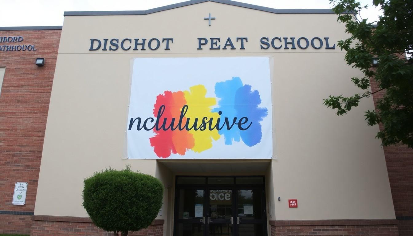
Shoppers are noticing creative diplomacy in school symbols , Bishop O’Dowd in Oakland swapped the traditional Pride flag for a rainbow-coloured “Inclusive O,” aiming to show support for LGBTQ+ students while easing community tensions. The move matters because it tries to balance belonging, faith, and campus unity at a time when Pride symbols are increasingly contested.
Essential Takeaways
- New symbol: Bishop O’Dowd replaced classroom Pride and Progress flags with an “Inclusive O,” a watercolor-style rainbow version of the school’s logo.
- Community-made: The design was developed over a year with students, staff, parents, counselors and LGBTQ+ community members.
- Support continues: The school keeps counselling, clubs, and new programs like an Inclusive Advisory Council and family retreat.
- Mixed reactions: Some alumni and students feel the switch reduces visible representation; others praise it as a pragmatic compromise.
- Context: The change followed diocesan pressure after a Progress flag was reported on campus and removed before summer break.
Why the Inclusive O landed on campus
The moment students return they’ll see a softer, painterly rainbow on the familiar O rather than separate Pride flags, a visual that feels more like art than a political statement. According to KRON-4, the angular capital O now carries watercolour smudges of red, orange, yellow, green, violet and blue, where the colours blend rather than sit in strict stripes. School leaders say the design was meant to communicate welcome without inflaming division.
This idea didn’t appear overnight. The president’s letter explained the school wrestled with “questions about Pride and Progress flags” as part of a larger conversation across Catholic education, and they wanted to avoid a symbol becoming a lightning rod that distracts from caring for students. For families and staff who prefer subtler cues of inclusion, the Inclusive O reads as reassuring and calm.
How the symbol was developed , a year of listening
School officials describe the O as the product of a year-long process of prayer, dialogue and design with faculty, student leaders, parents and LGBTQ+ community members. That participatory approach helped the logo feel owned by the community rather than imposed from on high. It’s a useful reminder that symbols stick when people help make them.
Practical take-away: if your school or organisation is navigating similar tensions, convene varied voices early and be transparent about goals , belonging, safety and unity , so changes don’t feel like public relations stunts.
What stays the same: services and student support
Bishop O’Dowd stresses the Inclusive O is not a substitute for support. The school’s counselling team, Health & Wellness staff, Unity Club and Pride Arts Club remain active, and officials plan new community art workshops, an LGBTQ+ family retreat and an Inclusive Advisory Council. Those concrete programmes are the things that directly affect student wellbeing, and staff here emphasise that visible symbols are only one piece of a broader effort.
For parents wondering whether the swap dilutes care, look at the services: ongoing clubs, counselling access and new events show the school intends substantive backing, not just symbolic gestures.
Why some critics say a bespoke symbol isn’t enough
Not everyone is satisfied. The San Francisco Chronicle reported alumni and students saying a school-specific logo lacks the history and recognition of the Pride flag, and some on social media argued the change removes a source of representation. That reaction matters because visibility itself can be a form of safety for LGBTQ+ youth.
There’s a trade-off here: a universally recognised flag signals clear solidarity, while an adapted logo may comfort some constituencies but feel like erasure to others. Schools facing this choice should weigh the emotional impact of visible symbols alongside the practical benefits of keeping community unity.
A pragmatic model amid wider rollbacks of Pride visibility
The O’Dowd approach comes as other institutions rethink public Pride displays; according to Inside Higher Ed, some colleges have recently backtracked on Pride-month symbols. Bishop O’Dowd’s solution is an example of creative compromise that other faith-based schools might study if they want to salute LGBTQ+ students while staying within diocesan guidelines.
My two-pence: creative branding can be a smart middle way, but it only works when matched by clear policies, programming and communication that make inclusion real, not just decorative.
It's a small change that can make every student feel more seen , if the symbolism is backed up by action.
Source Reference Map
Story idea inspired by: [1]
Sources by paragraph: