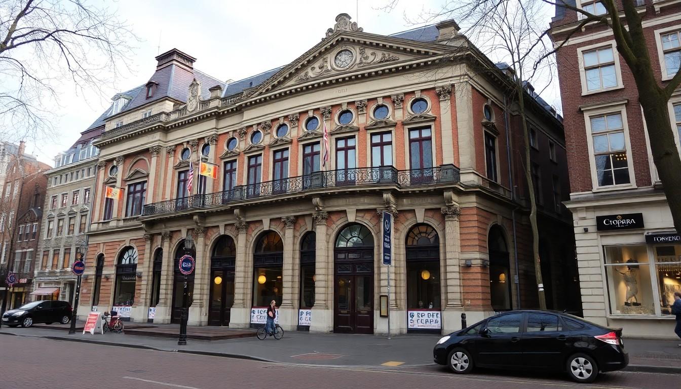
Shoppers and passport-seekers are discovering Queer Amsterdam: then, now and next , a free Stopera exhibition that maps 50 years of queer life through twelve portraits, intimate interviews and a mix of black‑and‑white and colour images. It matters because it brings private struggles into public space, where anyone might pause, recognise or learn.
Essential Takeaways
- Free and public: The portraits are installed in the Stopera city counter so a wide cross‑section of Amsterdammers will see them.
- Twelve voices: Photographer Martijn Gijsbertsen and journalist Tim van Erp present a dozen perspectives spanning five decades.
- Mixed tone: The show balances hard stories of harassment with humour, joy and visible resilience.
- Visibility as strategy: Makers keep pride flags and public faces prominent despite rising hostility; the work argues visibility matters.
- Empty space speaks: One withdrawn participant leaves a confrontingly blank panel, signalling real safety concerns.
A civic gallery that puts queer lives in the flow of city business
The first thing you notice is the everyday setting: people collect passports, register births and walk past portraits that might stop them mid‑stride. That ordinary context is exactly the point. According to the exhibition notes, the Stopera placement is deliberate , not a niche museum for the like‑minded but a site where normal daily life meets stories some visitors won’t otherwise encounter. It’s a quiet, visual nudge that queer lives are part of municipal life.
Van Erp and Gijsbertsen, from different generations, say they wanted those accidental meetings to happen. Bring the images where people already are, and you increase the chance a teenager, a curious neighbour or a casual commuter will linger and perhaps recognise themselves.
Portraits that mix laughter with hard edges
The show doesn’t flatten experience into victimhood. Several interviews include warm, funny moments , drag performer mishaps and family pride among them , alongside accounts of street harassment and violence. One dragqueen describes being attacked on Reguliersdwarsstraat, and how strangers rushed to help; that mix of danger and solidarity recurs in many pieces.
That tonal variety matters. It reflects how queer people often manage joy and trauma together, and it gives viewers more ways to connect: you might smile at a burlesque anecdote, then sit with the more serious bits.
Visibility vs safety: the decisions behind a flag and an empty frame
Both makers describe a bittersweet shift: they grew up amid optimism , the Gay Games and marriage equality , but now notice rougher reactions in recent years. They chose not to remove a pride flag despite jeers, insisting on visibility as civic claim‑making. At the same time, one participant withdrew because their immediate circle refused to accept them, leaving a blank space in the display as a powerful, silent testimony.
That blank panel is a smart curatorial move: it’s not just absence, it’s evidence that progress can be fragile, and that visibility carries risk for some people.
Why the combination of black‑and‑white and colour photos matters
The curators mixed classic black‑and‑white portraiture with vibrant colour shots to mirror time and feeling. The monochrome evokes memory and history; the colour brings people into the present, radiant and embodied. It’s a simple visual grammar that helps visitors map change across decades , how appearances, politics and public language have shifted , while still anchoring the human face in every frame.
For anyone choosing what to look at first, try the colour images to meet the personalities, then move to black‑and‑white for the backgrounds that shaped them.
What this exhibition means for Amsterdam , and what visitors can do
Beyond documentation, the show asks for small practical changes: hold a taxi door, refrain from remarks, notice your neighbour. Van Erp sums it up: you don’t have to love someone to be civil; you can simply treat difference as ordinary. The exhibition will host deeper public conversations later in the year, offering space for context and collective reflection.
If you visit, give yourself time to read one full interview and don’t rush the empty frame; sometimes the most useful lesson arrives in what the wall won’t show.
It's a modest, public invitation to see and be seen , and a reminder that making space for difference can begin at the passport counter.
Source Reference Map
Story idea inspired by: [1]
Sources by paragraph: