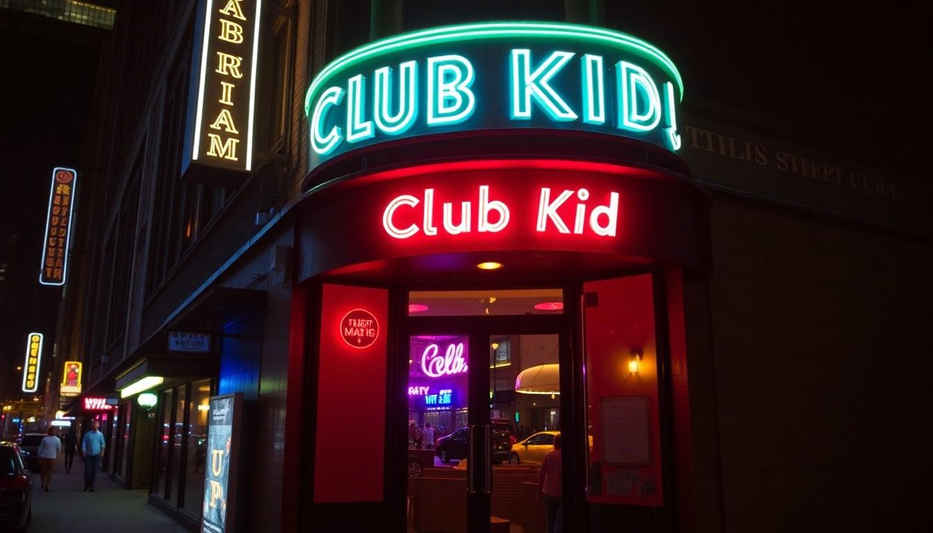
Shoppers and pop-culture fans are noticing Cara Delevingne’s cheeky summer cover for Playboy, which mixes glamour, rebellion and a female-led creative team , and matters because it reframes a long-standing brand while highlighting Delevingne’s return to screens in Club Kid.
Essential Takeaways
- Historic cast: Cara Delevingne is the first openly lesbian woman to appear on Playboy’s print cover, signalling a cultural shift.
- Creative control: The shoot was led by a predominantly female and queer creative team, giving it a deliberate, feminist edge.
- Brand reboot: Playboy has repositioned itself in recent years around inclusivity and pleasure as a human right, changing the context for the cover.
- Timing: The cover coincides with Delevingne’s high-profile return to film in Club Kid, keeping her in the headlines.
- Visual vibe: The images lean bold and provocative but feel intentional and controlled, with styling and poses that emphasise agency rather than objectification.
Why this cover feels like a small rebellion
Cara Delevingne framed the decision to pose for Playboy as a bit of a rebellious gesture, and you can see why. The magazine is historically a straight male gaze institution, so an out lesbian woman gracing the main print cover flips that script in a single frame. The photos carry a tactile, confident energy , the kind of shoot that smells of hairspray, silk and deliberate playfulness.
Playboy itself isn’t the same magazine it was decades ago. The company has publicly shifted its mission and values toward inclusivity and freedom of expression, which makes this cover less of a one-off stunt and more like the brand testing its new contours. For readers, that matters: it’s a reminder that legacy brands can evolve without losing the polished, glossy trappings we expect.
The importance of a female-led creative team
Delevingne emphasised the shoot was run by women and queer creatives, and that changes the tone instantly. When the people calling the shots share the subject’s perspective, poses and styling read differently , more collaborative, less exploitative. That’s a practical change: teams who understand queer representation will make choices that protect dignity while still creating striking imagery.
If you’re a reader noticing nuance, look for small cues in the visuals , hand placement, lighting, wardrobe choices , that signal consent and agency. That’s the difference between a photo that objectifies and one that celebrates.
How the timing ties into Club Kid buzz
Cara’s Playboy cover arrives while she’s riding the wave from Club Kid, the Cannes-talked-about film that marked her return to screens. Critics and festival coverage have been buzzing, and distribution deals followed quickly, so the cover helps keep momentum going. It’s smart PR timing: magazine covers still move the needle, especially when they feed into an ongoing narrative about an artist’s reinvention.
For fans and casual readers alike, this feels like a deliberate reintroduction , not just as a model or actor, but as a public figure reshaping how she’s seen.
What this means for representation in mainstream media
A high-profile cover like this nudges mainstream media toward more visible queer representation. It’s symbolic, yes, but symbols matter when they live on newsstands and social feeds. When brands with legacy status choose diverse covers, it normalises those faces and stories for a broader audience.
That said, always read the finer print: inclusion can be performative if it’s not backed by sustained change behind the scenes. But the presence of queer creatives on set and a public mission shift at Playboy are promising signs that this isn’t purely cosmetic.
Practical takeaway for readers and fans
If you’re curious, pick up the issue or browse the feature online with an eye for the collaborative touches: captions, credits and the creative team details will tell you who shaped the story. And if you’re tracking Cara’s career, use the cover as a jumping-off point to catch Club Kid when it’s released , it’s part of the same conversation about reinvention and visibility.
It’s a small, stylish flip of the script that makes a loud cultural point.
Source Reference Map
Story idea inspired by: [1]
Sources by paragraph: