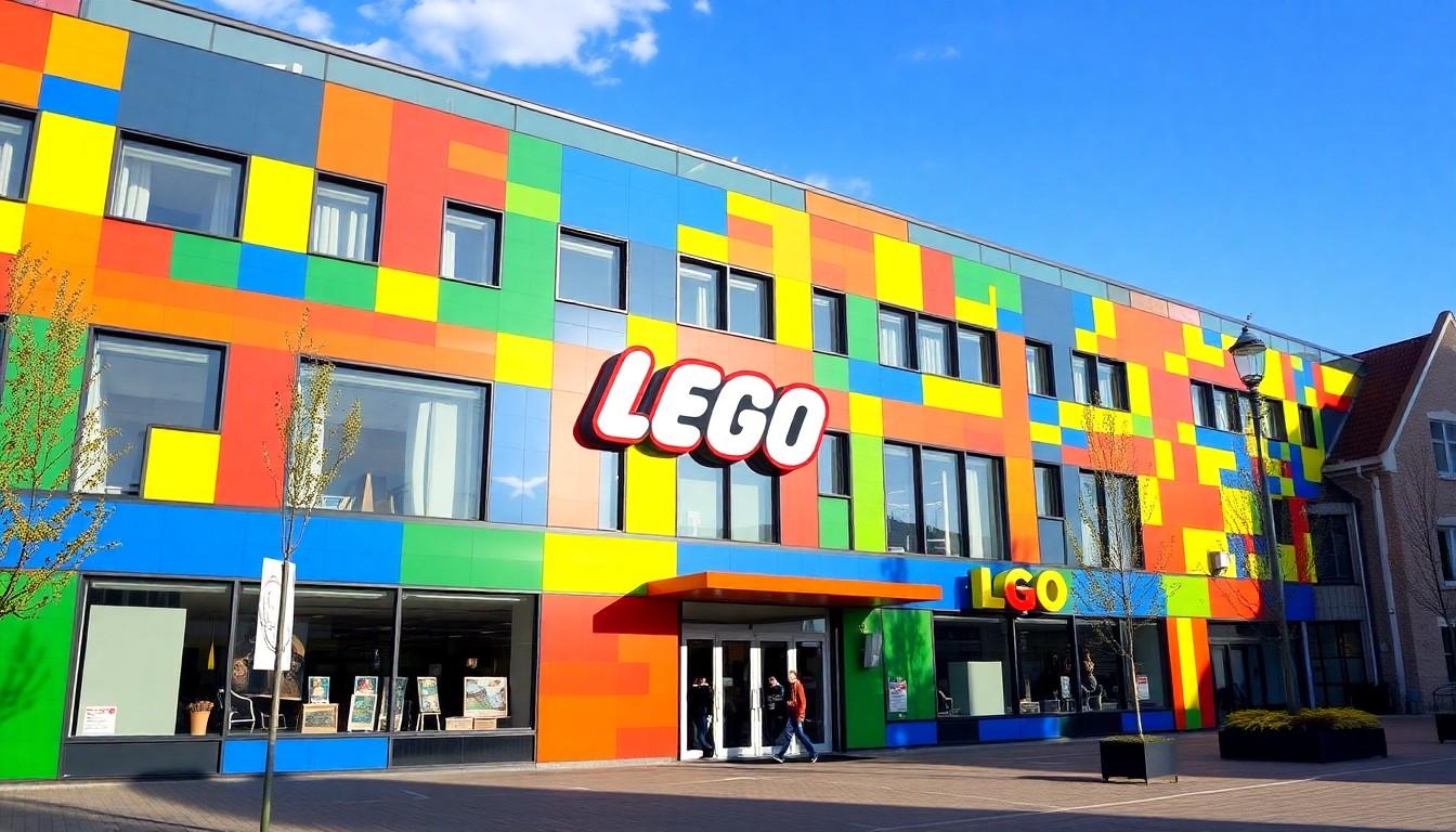
Shoppers are noticing Lego's Pride push, and it's sparking debate among parents, collectors and fans worldwide; the Denmark-based brand has leaned into Pride-themed sets and social posts, which matters because most Lego products are aimed at children and followable on social media.
Essential Takeaways
- Pride products exist: Lego launched the "Everyone Is Awesome" Pride set in 2021 and has promoted Pride activities since.
- Aimed audiences differ: The official release was marked 18+, though designers have said the message was intended to reach families and children too.
- Visible storytelling: Recent social posts include minifigure vignettes and colleague stories, giving the campaign a personal, human tone.
- Mixed reactions: The activity has won praise for visibility and allyship, while some parents have expressed concern and called for boycotts.
- Design and display: The set is a colourful, display-style Icons offering that works well as a shelf piece or conversation starter.
Why Lego's Pride move feels different this time
Lego's Pride push reads bold because the brand has such a close association with childhood play, with that familiar tactile snap of bricks and bright colours. According to Lego's own website, the "Everyone Is Awesome" set was unveiled as a celebration of LGBTQIA+ people and allies, a high-colour, display-style Icons product that nods to the Progress Pride flag. The visual nature of the set , eleven monochrome figures in flag hues , makes it less a toy for heavy play and more a statement piece, though people will use it however they want.
The backstory: a set, a designer's memory, and the label
When Lego released the set in 2021, it was listed as 18+, but Matt Ashton, the designer, spoke openly about his teenage experience of coming out and said the set would have meant a lot to him as a kid. That human element is central to why the company frames the release as both a designer-led expression and a broader message to families and allies. It's worth noting that Lego often balances play-oriented kits with adult-targeted Icons and collectible ranges, and that context explains the 18+ marker while not erasing the cultural intent behind the product.
What the social posts add , and why some parents react
More recently, Lego's Pride-related content has included short, story-led posts showing minifig characters and colleagues discussing coming out and attending Pride events. According to observers, this storytelling approach is designed to normalise and humanise experiences rather than sexualise them; the tone is personal and low-key. Still, some parents have objected, arguing the brand is promoting adult themes to a young audience and calling for boycotts. That split reaction highlights how cultural conversations play out differently across social feeds where families and adults both follow brands.
How to think about age labels and suitability
If you're weighing whether a Pride-themed Lego piece is right for your household, start with the product type and intent. The Icons line is primarily decorative and designed with display and sentiment in mind; it's not the same as small-part, play-focused sets marketed to toddlers. For families worried about appropriateness, look at recommended ages, the construction complexity and whether the set is intended as a keepsake. For those seeking representation, a shelf display like "Everyone Is Awesome" can be a quiet way to signal welcome and support.
The market reaction and wider retail trend
Lego's move sits alongside other brands that now produce Pride merchandise or run Pride campaigns, reflecting a wider retail trend of celebrating diversity at product and marketing levels. Coverage at launch noted the set's symbolic value and the supportive statements from Lego, while brick hobby sites catalogued the release under collector-friendly Icons. Expect more brands to navigate this balance between cultural messaging and child-facing audiences in the years ahead.
It's a small change that can open up bigger conversations at home, whether you buy the set for colour, for a statement, or simply because it looks great on the mantel.
Source Reference Map
Story idea inspired by: [1]
Sources by paragraph: