Shoppers are clicking replay on Calvin Klein’s latest Pride drop as choreographer Sam Salter, artist Deon Hinton and model Jordan Rand bring personality, movement and a promise of real impact to a colourful underwear and tank line that matters beyond the bragging rights. It’s trending because it’s both hot and humane.
Essential Takeaways
- Creator-led cast: Sam Salter, Jordan Rand and Deon Hinton front the collection, giving each piece a distinct personality rather than a one-note rainbow.
- Design notes: Rainbow-gradient underwear, crop tanks and classic stretch cotton boxers in vivid pinks, oranges and blues; pieces look bright and wearable.
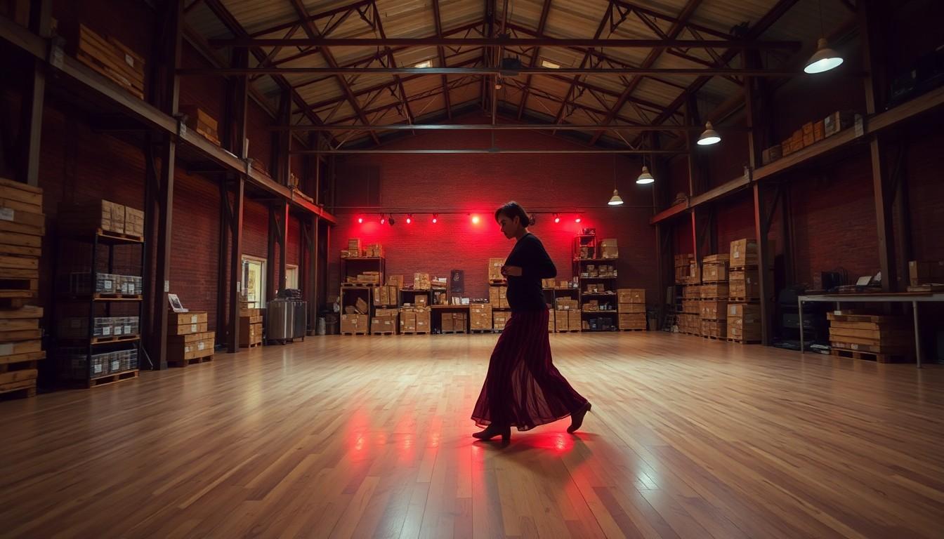
- Campaign energy: Filmed in a raw warehouse setting, the shoot focuses on movement and sweat , Salter dances with infectious abandon.
- Commitment: Calvin Klein says it will financially support LGBTQIA+ organisations tied to the rollout, not just slap on a logo.
- Feel: The line reads confident and lived-in , colourful, sweaty and playful rather than corporate and generic.
Why the campaign stands out: movement, not just marketing
The first thing you notice about the campaign is motion , Sam Salter dancing as if the music owns him, limbs cutting through a pulsing house track and leaving a wake of glittering sweat. It’s a refreshingly tactile image: fabric clinging, muscles flexing, colour smeared across skin. According to PVH, the collection is intentionally creator-led, which explains why the visuals feel personal rather than staged. In a market full of token rainbows, showing Pride as something kinetic and human makes a real difference.
A fuller picture: three creatives, three styles
Calvin Klein didn’t cast a single face for this; they invited three voices. Salter brings the kinetic theatre, Jordan Rand contributes the model-off-duty charisma and Deon Hinton supplies intimate, self-shot portraits that emphasise craftsmanship and closeness. JustJared and other outlets noted how the mix helps the campaign avoid the flatness of corporate rainbow-washing. For shoppers, that means the collection reads like pieces you’d actually want to wear, not props for an Instagram post.
Design and wearing notes: what the underwear actually feels like
Expect stretch cotton boxers and rainbow-gradient briefs that sit bright and snug rather than stiff or costume-y. The muscle crop tanks give a sporty, lived-in vibe; the fabric looks soft against the skin and easy to style under a jacket or as festival wear. For those who buy into seasonal capsule dressing, these are practical pieces that work beyond June. If you’re choosing size, stick with your usual for the stretch cotton and consider sizing up only if you prefer a roomier fit.
Beyond aesthetics: the money and meaning question
One of the most common criticisms of Pride collections is performative charity. Calvin Klein’s press material and reporting around the launch stress a financial commitment to LGBTQIA+ organisations, which changes the conversation from purely promotional to philanthropic. The difference matters: supporting vetted organisations and spotlighting creators who’ve shared their own coming-out stories adds weight to the campaign. It’s the kind of move that turns a glossy drop into something with staying power.
Cultural reaction and what it says about Pride marketing now
Reaction online has been predictably ecstatic , fans praising the cast, the colours and, yes, the choreography. But there’s a subtler takeaway: consumers now expect campaigns to be authentic and creator-centred. Hypebeast and other fashion outlets have charted this shift since earlier Pride efforts, and Calvin Klein’s approach feels like the latest iteration. Brands that mix visual polish with genuine creator input and a clear pledge to back community causes are the ones that land best.
It's a small change that can make every rainbow feel worth wearing.
Source Reference Map
Story idea inspired by: [1]
Sources by paragraph: