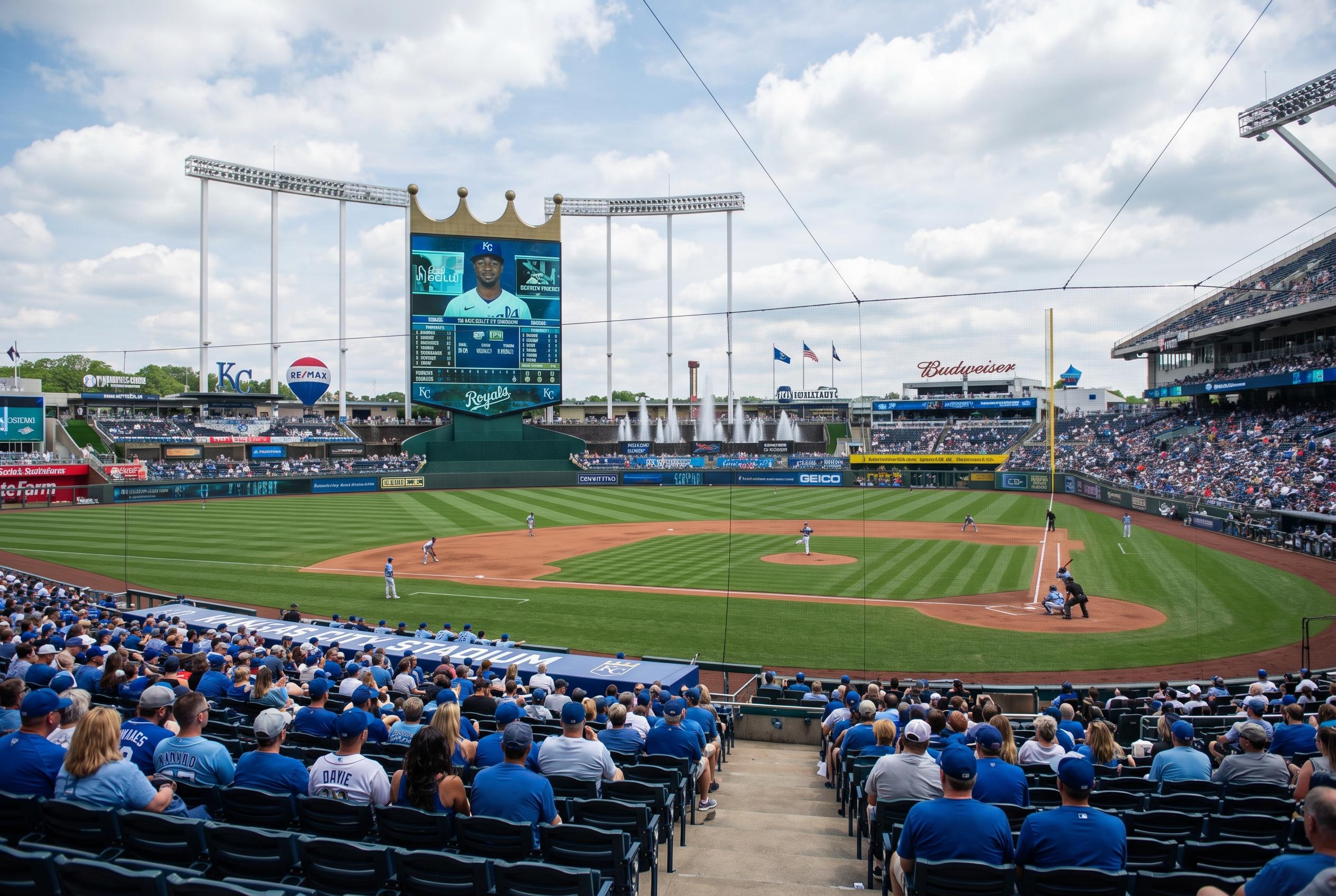
Shoppers and fans are spotting something new: the Kansas City Royals’ City Connect jersey features a magenta‑purple‑blue gradient that many say echoes the Bisexual Pride flag , a surprising, stylish nod that’s already sparking chatter among queer fans, pop icons and baseball lovers across the US.
- Colour detail: The City Connect uses magenta, purple and blue in a subtle gradient that visually matches the Bisexual Pride palette.
- Design touches: Includes a “Heart of America” sleeve patch and inner‑collar lyric nods to the team’s victory chant, adding local texture.
- Cultural echo: Fans and writers have linked the look to queer culture, recalling past ties between the Royals and pop music (Lorde’s “Royals” inspiration).
- Wearability: The gradient reads well in photographs, looks modern in person and pairs easily with casual streetwear , it feels playful, bold and a little theatrical.
Why this jersey feels different , and a little personal
The first thing you notice is colour: the magenta leaning into purple and into blue gives the shirt a soft, dreamy wash rather than a stark rainbow or a single team hue. It’s an unexpected departure from the Royals’ decades‑long blue identity, and that visual shift is what’s sending fans into a happy double‑take.
Outsports reported that several LGBTQ fans immediately recognised the colour trio as the Bisexual Pride flag , and the social reaction has been equal parts delighted and cheeky. The jersey doesn’t announce an official Pride tie‑in, but the resemblance has already made it a favourite among people who like their teamwear to carry a little extra meaning.
How this ties back to pop culture and Kansas City lore
This isn’t the Royals’ first brush with pop‑culture queer affinity. Writers have long noted that Lorde’s hit “Royals” was inspired by a photo of George Brett in uniform, an anecdote covered by Sports Illustrated and NBC News that helped cement the team’s place in musical trivia and queer playlists alike.
That backstory gives the new City Connects an extra chewable layer: fans can see it as a clever, unintentional cultural echo or a piece of kit that feels tailor‑made for queer icons and PR moments , picture a cameo by a pop star or athlete known for bold fashion. Either way, it’s a jersey that invites commentary.
How to style it and why it’s such a good gift piece
Treat the gradient like a statement tee. It plays tidy with neutral denim, crisp white trainers or even a leather jacket if you’re leaning glam. For gift‑giving, it’s a safe bet for fans who like to wear identity visibly but subtly; the hint of bi‑flag colours means it reads as inclusive without being loud.
If you’re buying for someone who chews through shirts, size up for comfort and wash inside out to preserve the subtle fade of the gradient. And if you’re a collector, keep an eye on how teams release alternate kits , City Connect runs can be limited, so snagging one early is usually wise.
Why the baseball world is leaning into identity through kits
MLB has leaned into City Connects as a chance to tell local stories, and that’s created room for playful design choices that feel rooted in place and people. The Royals’ version mixes civic nods , like the Heart of America patch and lyric‑inside collar , with a palette that now resonates with a specific queer community.
The result is a jersey that does more than advertise a team; it invites conversation. Fans are responding because sportwear that nods to identity makes the ballpark feel more like a community space, and that matters as teams look to broaden their audiences.
It's a small design choice that’s already sparking big feelings , and a reminder that colour, even on a shirt, can mean a lot.
Source Reference Map
Story idea inspired by: [1]
Sources by paragraph: